Blog Layout
How to create a Lightning tab menu with dropdown sub-menu
Mike Arthur • Mar 23, 2020
No out of the box option so I built my own
Display a row of tabs. When one of them is clicked, it displays a dropdown sub-menu, allowing the user to click on one of the options.

This is the component:
 <aura:component>
    <aura:attribute name="activeTab" type="String" default="home"/>
    <!--
        Convention when adding a new tab -
            The aura:id of the tab must follow the pattern 'tabname-tab-auraid'
            where 'tabname' is some identifier for the tab.
            The data-tab value of the tab must be tabname
            The aura:id of the tab content must follow the pattern 'tabname-content-auraid'
            Add the tabname to the allTabs array in the helper.  The order is not important.
        To remove a tab -
            Remove the tab and tab content below
            Remove tabname from the allTabs array in the helper
    -->
    <div class="slds-tabs_default">
        <ul class="slds-tabs_default__nav" role="tablist">
            <!-- Tabs -->
            <!-- Home tab -->
            <li class="slds-tabs_default__item slds-active" title="Home Tab" role="presentation" aura:id="home-tab-auraid">
                <a class="slds-tabs_default__link" href="javascript:void(0);" role="tab" tabindex="0" aria-selected="true" aria-controls="home-content" id="home-tab" onclick="{!c.switchTabs}" data-tab="home">Home</a>
            </li>
            <!-- Accounts tab -->
            <li class="slds-tabs_default__item" title="Accounts Tab" role="presentation" aura:id="company-vis-tab-auraid">
                <a class="slds-tabs_default__link" href="javascript:void(0);" role="tab" tabindex="-1" aria-selected="false" aria-controls="accounts-content" id="accounts-tab" onclick="{!c.switchTabs}" data-tab="accounts">Accounts</a>
            </li>
            <!-- Example tab with dropdown -->
            <li class="slds-tabs_default__item slds-tabs_default__overflow-button" title="Example" role="presentation" aura:id="example-tab-auraid">
                <div aura:id="menuExample" class="slds-dropdown-trigger slds-dropdown-trigger_click">
                    <button class="slds-button" aria-haspopup="true" onclick="{!c.toggleExampleMenu}" data-tab="example">Example
                            <lightning:buttonIcon iconName="utility:chevrondown"  size="small" variant="bare" alternativeText="Example" />
                    </button>
                    <div class="slds-dropdown slds-dropdown_right">
                        <ul class="slds-dropdown__list slds-dropdown_length-with-icon-10" role="menu">
                            <li class="slds-dropdown__item" role="presentation">
                                <a href="javascript:void(0);" role="menuitem" tabindex="-1" aria-controls="option1-content" id="option1-tab" onclick="{!c.switchTabs}" data-tab="option1">
                                    <span class="slds-truncate" title="Option 1 Tab">Option 1</span>
                                </a>
                            </li>
                            <li class="slds-dropdown__item" role="presentation">
                                <a href="javascript:void(0);" role="menuitem" tabindex="-1" aria-controls="option2-content" id="option2-tab" onclick="{!c.switchTabs}" data-tab="option2">
                                    <span class="slds-truncate" title="Option 2 Tab">Option 2</span>
                                </a>
                            </li>
                            <li class="slds-dropdown__item" role="presentation">
                                <a href="javascript:void(0);" role="menuitem" tabindex="-1" aria-controls="option3-content" id="option3-tab" onclick="{!c.switchTabs}" data-tab="option3">
                                    <span class="slds-truncate" title="Option 3 Tab">Option 3</span>
                                </a>
                            </li>
                        </ul>
                    </div>
                </div>
            </li>
        </ul>
        <!-- Tab contents -->
        <!-- Home content -->
        <aura:if isTrue="{!v.activeTab == 'home'}">
            <div aura:id="home-content-auraid" id="home-content" class="slds-tabs_default__content slds-show" role="tabpanel" aria-labelledby="home-tab">
                <p>Home tab content goes here</p>
            </div>
        </aura:if>
        <!--  Accounts content -->
        <aura:if isTrue="{!v.activeTab == 'accounts'}">
            <div aura:id="accounts-content-auraid" id="accounts-content" class="slds-tabs_default__content slds-hide" role="tabpanel" aria-labelledby="accounts-tab">
                <p>Accounts tab content goes here</p>
            </div>
        </aura:if>
        <!-- Option 1 content -->
        <aura:if isTrue="{!v.activeTab == 'option1'}">
            <div aura:id="option1-content-auraid" id="option1-content" class="slds-tabs_default__content slds-hide" role="tabpanel" aria-labelledby="option1-tab">
                <p>Option 1 content goes here</p>
            </div>
        </aura:if>
        <!-- Option 2 content -->
        <aura:if isTrue="{!v.activeTab == 'option2'}">
            <div aura:id="option2-content-auraid" id="option2-content" class="slds-tabs_default__content slds-hide" role="tabpanel" aria-labelledby="option2-tab">
                <p>Option 2 content goes here</p>
            </div>
        </aura:if>
        <!-- Option 3 content -->
        <aura:if isTrue="{!v.activeTab == 'option3'}">
            <div aura:id="option3-content-auraid" id="option3-content" class="slds-tabs_default__content slds-hide" role="tabpanel" aria-labelledby="option3-tab">
                <p>Option 3 content goes here</p>
            </div>
        </aura:if>
    </div>
</aura:component>
Here is the controller:
 ({
    switchTabs: function(component, event, helper) {
        /* Use html5 data attributes to pass the tab name as the
         * data-tab attribute in the onclick event in component
         */
        var tab = event.currentTarget.dataset.tab;
        component.set("v.activeTab", tab);
        helper.deactivateAllTabs(component, event, helper);
        helper.activateTab(component, event, helper, tab);
    },
    toggleExampleMenu: function(component, event, helper) {
        var exampleMenu = component.find("menuExample");
        $A.util.toggleClass(exampleMenu, 'slds-is-open');
    },
})
and here is the helper:
 ({
    /* For all tabs, remove Classes that make the tab visible and
     * add Class to hide the tab
     */
    deactivateAllTabs: function(component, event, helper) {
        // When adding a new tab, the tabname must be added to the allTabs array:
        var allTabs = [
            'home',
            'accounts',
            'example',
            'option1',
            'option2',
            'option3'
        ]
        // Hide the dropdown on Example menu:
        $A.util.removeClass(component.find("menuExample"), 'slds-is-open');
        // Deactivate all tabs:
        allTabs.forEach(deactivate);
        function deactivate(item) {
            var tabToDeactivate = component.find(item + '-tab-auraid');
            var contentToHide = component.find(item + '-content-auraid');
            $A.util.removeClass(tabToDeactivate, 'slds-active');
            $A.util.removeClass(tabToDeactivate, 'slds-has-focus');
            $A.util.removeClass(tabToDeactivate, 'tabActive');
            $A.util.removeClass(contentToHide, 'slds-show');
            $A.util.addClass(contentToHide, 'slds-hide');
        }
    },
    /* For the active tab, add Classes to make the tab visible and
     * remove Class that hides the tab
     */
    activateTab: function(component, event, helper, tab) {
        var tabToActivate = component.find(tab + '-tab-auraid');
        var contentToShow = component.find(tab + '-content-auraid');
        $A.util.addClass(tabToActivate, 'slds-active');
        $A.util.addClass(contentToShow, 'slds-show');
        $A.util.removeClass(contentToShow, 'slds-hide');
        // If it's an overflow tab we need to activate the parent:
        var overflowTabs = [
            'option1',
            'option2',
            'option3'
        ];
        if (overflowTabs.includes(tab)) {
            $A.util.addClass(component.find('example-tab-auraid'), 'slds-has-focus');
            $A.util.addClass(component.find('example-tab-auraid'), 'tabActive');
        }
    },
})
My Blog of Salesforce Stuff
'XHR Failed' error when trying to install VS Code extension
What is $A (dollar A) in Lightning Aura component framework? Is it a global variable? Where are the docs for $A?
Authorise a Salesforce Connected App using OAuth 2.0 JWT Bearer Flow
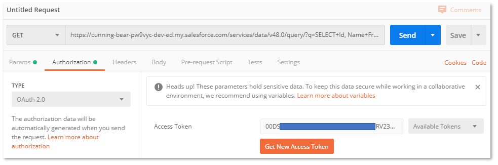
REST API Connection to Salesforce Connected App Using OAuth 2.0 Authentication from Postman
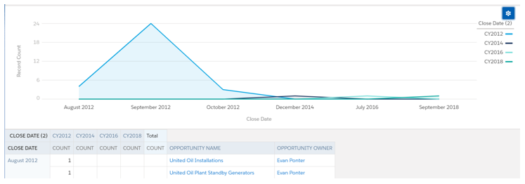
How to show a month by month trend chart with multiple years on same chart
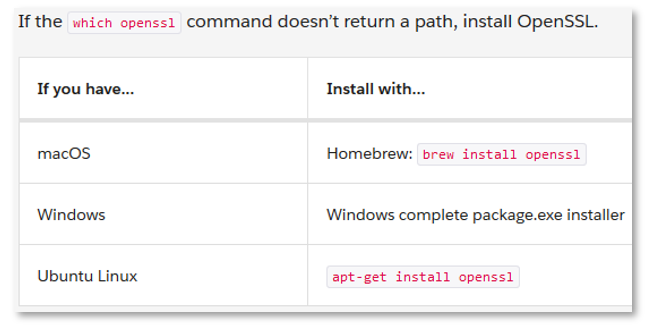
What to do if you receive emails about expiring certificates

Process json strings when working with integrations
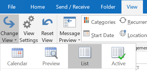
If you're switching email accounts you can copy appointments from one calendar to the other
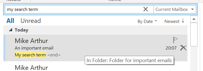
When you search in Outlook 2016, how do you see in which folder you filed an email in the results?
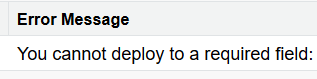
A change set or ant deployment will fail if a field that is required in the field definition is included in a profile or permission set that is being deployed